Chapter 1 Introduction to statistics
This chapter was written with Deodat E. Mwesiumo.
1.1 Data, information, knowledge and decision-making
Business owners and managers make decisions on a daily basis, addressing everything from day-to-day operational issues to long-range strategic planning. Indeed, decision-making is the bread and butter of managers and executives, who make about three billion decisions each year. In order to make effective decisions managers require knowledge.
Data is a collection of figures and facts, and is raw, unprocessed, and unorganized. The Latin root of the word “data” means “something given”, which is a good way to look at it. In other words, data are the facts of the World, for example, take yourself. You may be 5.5ft tall, have brown hair and blue eyes. All of this is “data”. In many ways, data can be thought of as a description of the World. We can perceive data with our senses, and then the brain can process it.
Information. Individuals and organizations cannot do much with unprocessed data because it is so random. Once data is given structure, organized in a cohesive way, and is able to be interpreted or communicated, it becomes information. It is important to note that information is not just data that has been neatly filed away; it has to be ordered in a way that gives meaning and context. Information is what allows people to use data for reasoning, calculations, and other processes. With that said, data’s importance lies in the fact that it is a building block. Without it, we cannot create information.
Knowledge. Knowledge is what we know. Think of this as the map of the World we build inside our brains. Like a physical map, it helps us know where things are – but it contains more than that. It also contains our beliefs and expectations. “If I do this, I will probably get that.” Crucially, the brain links all these things together into a giant network of ideas, memories, predictions, beliefs, etc. It is from this “map” that we base our decisions, not the real world itself. Our brains constantly update this map from the signals coming through our eyes, ears, nose, mouth and skin. Knowledge comes from information and information comes from data.
In summary, data has no meaning until it is turned into information. In order for people to interpret data or make any use of it, they must understand. For instance, a company’s sales figure for one month is a piece of data that is meaningless because it has no context. It tells nothing, and there is little that anyone can do with it as is. However, if you take a business’s sales figures from three months and compute their average, you would be able to derive many bits of information from that data. When one has incomplete data, it is highly likely that it will be misinterpreted and lead to the development of misinformation. For example, suppose someone saw that his business’s sales were up by 4%, and he drew the conclusion that his current marketing campaign was working well. However, if she found out that a competitor who sold the same products had a sales increase of 16% during the same period, she would start to question just how well her campaign really performed and she would probably want to gather more facts (data) to analyze the situation again.
1.2 Statistics
1.2.1 Overview
Statistics is the science that deals with the collection, classification, analysis, and interpretation of numerical facts or data, and that, by use of mathematical theories of probability, imposes order and regularity on aggregates of disparate elements. Simply put, statistics involves collecting, classifying, summarizing, organizing, analyzing, and interpreting numerical information. Statistics is applied in a wide range of areas such as economics (e.g. forecasting, demographics), engineering (e.g. construction, materials), sports (e.g., individual and team performance), business (e.g., consumer preferences, financial trends) etc.
As one would expect, statistics is largely grounded in mathematics, and the study of statistics has lent itself to many major concepts in mathematics, such as probability distributions, samples and populations estimation, and data analysis. However, much of statistics is also non-mathematical. This includes:
- ensuring that data collection is undertaken in a way that produces valid conclusions
- coding and archiving data so that information is retained and made useful for international comparisons of official statistics
- reporting of results and summarized data (tables and graphs) in ways comprehensible to those who must use them
- implementing procedures that ensure the privacy of census information
1.2.2 Branches of statistics
There are two main branches of statistics, namely descriptive statistics and inferential statistics. Both are important.
Descriptive Statistics deals with the presentation and collection of data. This is usually the first part of a statistical analysis. As its name suggests, the purpose of descriptive statistics is to describe data. Descriptive statistics, in short, help describe and understand the features of a specific dataset by giving summarized information about it. For example, a quality controller for a fictitious company called Molde AS may inspect a sample of 100 components from assembly line 1 to assess the number of defective components. Molde AS has very high standards for quality and therefore they only approve flawless components. If a component has at least one fault, they consider it as defective. The findings of the controller reported below and their visualization (figure 1.1) are examples of descriptive statistics.
## DF2
## Defective  Flawless
##        16        84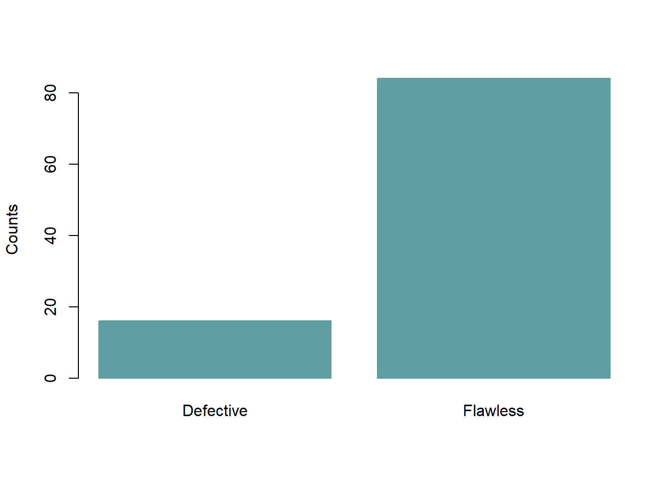
Figure 1.1: Number of defective/flawless components .
Inferential statistics is concerned with drawing conclusions (“inferences”) from data. With inferential statistics, you take data from samples and make a generalized statement about a population. For example, the quality controller at Molde AS may proceed and state that about 16% of all components from assembly line 1 are defective. Making such a generalization involves inferential statistics.
1.3 Variables
You will not be able to do very much in statistical analysis unless you know how to talk about variables because the methods applied are different for different types of variables. A variable is any entity that can take on different values. OK, so what does that mean? Anything that can vary is a variable. For instance, age is a variable because age can take different values for different people or for the same person at different times. Similarly, production volume, sales volume, country, number of customers, population, and income are variables because each of them can assume different values. Therefore, data is a specific measurement of a variable– the value you record in your data sheet.
Table 1.1 shows an example of a datasheet, variables and values.
| name | yb | sales | n_employees |
|---|---|---|---|
| Kepto AS | 35 | 450 | 70 |
| Diamond AS | 24 | 164 | 65 |
| Metalmasters AS | 12 | 600 | 250 |
| FoodPro AS | 28 | 1200 | 300 |
| J&M AS | 5 | 92 | 32 |
| Greenex AS | 10 | 45 | 90 |
1.3.1 Types of variables
There are two types of variables: quantitative and categorical variables. Quantitative variables are variables where numerical values are meaningful. That is to say, the numbers recorded on quantitative variables represent real amounts that we can add, subtract, divide, etc. There are two types of quantitative variables: discrete and continuous. Discrete variables are variables that can only assume a limited number of prescribed values. Conversely, a continuous variable can assume any value in an interval. Table 1.2 provides examples of discrete and continuous variables.
| Types of variables | What does the data represent? | Examples |
|---|---|---|
| Discrete variables | Counts (frequency) of individual items or values. | Number of suppliers for a company |
| Number of firms in a region | ||
| Number of defective items | ||
| Continuous variables | Measurements of continuous or non-finite values. | Selling price of a house |
| Exact weight of a farmed salmon | ||
| Annual cost of operating a business |
NB: The best way to distinguish between a continuous or discrete variable is this one: If x is a variable and it makes practical sense to assign/estimate a specific probability to each outcome \(x = 0, x = 1, \ldots\), then we have a discrete variable. For example if \(x\) is the number of rooms in a (random) apartment for sale, one could naturally speak of the probability that \(x\) is \(1, 2, 3, . . . , 10\) (say), so this is naturally a discrete variable. If it makes more sense to speak of probability that \(x\) is in an interval, (e.g. the probability that x is between 1 300 000 and 1 500 000), then we have a continuous variable. It would be highly inconvenient to operate with an analysis where we should estimate individual probabilities for say, x = 1300000, 1300001,…, if \(x\) is a variable like the selling price of a house.
Categorical variables represent groupings of some kind. They are sometimes recorded as numbers, but the numbers represent categories rather than actual amounts of things. There are two main types of categorical variables: nominal and ordinal variables. Nominal variables describe things purely qualitatively such that the values cannot be ordered or ranked in any sensible way. Dichotomous/binary variables are nominal variables which have only two categories or levels. As for ordinal variables, the categories can be ranked or ordered meaningfully. Table 1.3 presents examples of binary, nominal and ordinal variables.
| Type of variable | What does the data represent? | Examples |
|---|---|---|
| Nominal variables | Groups with no order between them | Species names |
| Colors | ||
| Brands | ||
| Binary variables | Yes/no outcomes | Heads/tails in a coin flip |
| Defective/flawless product | ||
| Employed/unemployed | ||
| Ordinal variables | Groups that are ranked in a specific order | Finishing place in a race |
| Rating scale responses in a survey |
So let us look at a small data set and see if we can classify the variables in terms of the types listed above. Table 1.4 shows an extract of data collected on Norwegian firms in four industries: manufacturing, oil and gas, construction, and consulting. The data were collected through a survey and the description of the variables is provided in Table 1.6.
| firm | industry | rev2019 | suppf | colriskmit | reldur |
|---|---|---|---|---|---|
| 1 | Manufacturing | 25636 | 6 | 4 | 0 |
| 2 | Construction | 60686 | 3 | 5 | 0 |
| 3 | Oil and gas | 61972 | 3 | 2 | 1 |
| 4 | Oil and gas | 18511 | 6 | 4 | 0 |
| 5 | Construction | 6916 | 6 | 2 | 0 |
| 6 | Oil and gas | 746530 | 3 | 5 | 0 |
| 7 | Manufacturing | 309 | 6 | 1 | 1 |
| 8 | Manufacturing | 6076 | 2 | 1 | 1 |
| 9 | Consulting | 5970 | 4 | 7 | 0 |
| 10 | Manufacturing | 22014 | 7 | 1 | 1 |
| 11 | Construction | 6521 | 5 | 2 | 0 |
| 12 | Manufacturing | 5831 | 3 | 5 | 1 |
To have a basis for asserting the types of variables, the descriptions are useful.
| Variable | Description | Variable type |
|---|---|---|
| firm | A firm on which data is collected | Nominal |
| industry | An industry to which the firm belongs | Nominal |
| rev2019 | Total revenue in 2019 (in 000 NOK) | Continuous |
| suppf | An answer to the question: To what extent are you satisfied with your major supplier” [1= Very dissatisfied ; 7= Very satisfied] | Ordinal |
| colriskmit | To what extent do you collaborate with your major supplier in assessing and mitigating supply risks [1=Not at all ; 7= to a very great extent] | Ordinal |
| regprod | Have you been dealing with your main supplier for more than 10 years? [1= yes; 0 = no] | Nominal (Binary) |
1.4 More about descriptive statistics
Section 1.2.2 introduced descriptive statistics as one of the branches of statistics. This section will introduce techniques for descriptive statistics. Essentially, descriptive statistics is an appropriate choice when the analysis aims at identifying characteristics, frequencies, trends, and categories. As we will see in this section, different techniques are used for examining quantitative (numerical) and categorical data.
1.4.1 Examining quantitative data
Recall that outcomes of quantitative/numerical variables are numbers on which it is reasonable to perform basic arithmetic operations. For example, the Rev2019 variable in Table 1.4, which represents a firm’s total revenue in 2019, is numerical since we can sensibly discuss the difference or ratio of the revenue in two firms. Quantitative data can be examined and summarized by using key numbers or graphics.
1.4.2 Key numbers for examining quantitative data
The Mean The mean is the most common way to measure the central value of a numerical variable. A set of \(n\) records of the variable \(x\) is given by indexed numbers like \[ x_1, x_2, \ldots ,x_{n} .\]
To find the mean, simply sum all the \(n\) observed values of \(x\) and divide the sum by n. Formally, the mean \(\bar{x}\) is given by: \[\begin{equation} \bar{x} = \frac{1}{n} \sum_{i=1}^{n} x_i \tag{1.1} \end{equation}\]
Example 1.1 (Mean value) Find the mean of the variable years in business in Table 1.1. The mean is:
\[ (35+24+12+28+5+10)/6 = 19 \ \mbox{years}\;. \]
Example 1.2 (Mean value) Find the mean of the variable rev2019 in Table 4a. The mean is:
\[ (25636+60686+ \cdots +5831)/12= 80 581 000 \ \mbox{NOK (recall: the data are x 1000 NOK)} \;. \]
NB: The mean is commonly thought to be representative for the “typical” object in the sample. This can sometimes be misleading, because the mean can be affected by a few or even just one single extreme/atypical values. If we consider mean as a “typical” value, one should expect that approximately 50% of the sample would be above the mean and 50% would be below the mean. As such, the mean of the variable years in business in Example 1.1 can be considered as being a “typical” value. However, for rev2019 in Example 1.2 we find that only one firm (firm) has revenue above the mean, representing just 8.3% of the observations. Clearly, the mean is not a typical value in this case. Now, if we exclude firm 6 from the data, the mean becomes 20 040 180 NOK, way lower than 80 581 000 NOK. What we observe here is that the mean given in Example 2 was mostly affected by the revenue of firm 6. Since the mean value is affected by extreme observations, it is not a robust measure.
The median. The Median is the “middle” of a sorted list of values for a given variable. Assume that a set of \(n\) records of variable \(x\) is \(x_1, x_2, \ldots ,x_{n}\). Two approaches are used to find the median, depending on the number of observations (\(n\)). If \(n\) is odd, place the numbers in value order and find the middle. If \(n\) is even, find the middle pair of numbers, and then find the value that is half way between them. This is easily done by adding them together and dividing by two.
Example 1.3 (Median value) Find the median of the variable rev2019 in table 1.4, considering with and without firm 6.
With firm 6: Here \(n = 12\), we arrange the numbers in increasing order and take the average of the middle two:
We arrange the observations in value order: 309, 5831, 5970, 6076, 6521, 6916, 18511, 22014, 25636, 60686, 61972, 746530
The middle ones are observation 6 and 7, i.e. 6916, 18511
The average is (6916 + 18511)/2 = 12713 and this is the median in this case. It’s 12 713 000 NOK.
Without firm 6: Since n becomes an odd number (11) after excluding firm 6, then we use the first approach as follows:
We arrange the observations in value order: 309, 5831, 5970, 6076, 6521, 6916, 18511, 22014, 25636, 60686, 61972
We pick the middle observation : 309, 5831, 5970, 6076, 6521, 6916, 18511, 22014, 25636, 60686, 61972
The median is therefore 6 916 000 NOK.
Although the medians are somewhat different in the two cases, the difference is much smaller than when we compared the means above. The median is called a robust measure because it is much less affected by extreme values. For a “real world” example where the median is a more meaningful measure of central tendency, think of the annual income of a group of randomly selected people in a developed country. Most people are employees with a job income in a certain predictable range. However, for some reason a few people obtain incomes wildly above the typical levels. For a sample of people, the mean income is clearly at risk of being affected by one or a few persons with extreme incomes. The important lesson is that when using means to describe data, you should always have in mind the possibility of data points that differ significantly from other observations that can affect the computed mean adversely. Such data points are called “outliers”.
Variance and Standard Deviation. We have that the mean and median are used to describe the center of the data set, and thus they are called measures of central tendency. However, the variability in the data, i.e. to what degree the data tend to vary or deviate away from the mean or median value, is also important. Here, we introduce two measures of variability: the variance and the standard deviation. Between these two, it is easier to understand the standard deviation as it roughly describes how far away the typical observation is from the mean. Assume a sample of data consist of \(n\) records of variable \(x\) is \(x_1, x_2, \ldots ,x_{n}\) the sample variance, denoted by \(s^2\), is defined as: \[ s^2 = \frac{1}{n-1} \sum_{i=1}^{n} (x_i - \bar{x})^2 = \frac{(x_1 - \bar{x})^2 + \cdots + (x_n - \bar{x})^2}{n-1} \;. \tag{1.2} \]
In statistical literature, you will find also the notation \(S^2\) with uppercase \(S\) for the sample variance.
The sample standard deviation is the square root of the variance: \[ s = \sqrt{s^2}\;. \]
NB: Sometimes it is necessary to make clear which variances/standard deviations belong to which variables. We then use the notation \(s_x^2\) and \(s_x\) to indicate that \(x\) is the variable.
Example 1.4 (Deviations) Let’s compute the deviations of the observed values from the mean value the variable years in business in Table 1.1. From Example 1.1 we know that the mean value of the variable years in business is 19. Therefore the deviations are: \[\begin{align*} x_1- \bar{x} & = 35-19 = 16 \\ x_2- \bar{x} & = 24-19 = 5 \\ x_3- \bar{x} & = 12-19 = -7 \\ x_4- \bar{x} & = 28-19 = 9 \\ x_5- \bar{x} & = 5-19 = -14 \\ x_6- \bar{x} & = 10-19 = -9 \end{align*}\]
With the deviations from this example, we easily go on to compute the variance and standard deviation.
Example 1.5 (Variance and standard deviation) Since we already have deviations of the values of the variable years in business, the variance is easily computed by plugging the deviations into the appropriate formula (1.2). We get \[ s^2 = ((16)^2+(5)^2 + (-7)^2+ (9)^2+ (-14)^2+ (-9)^2)/(6-1) = 137.6 \] Since we already have the variance, the standard deviation is easily computed by taking the square root. \[ s = \sqrt{137.6} = 11.73\;. \]
NB: In terms of interpretation, the standard deviation value \(S\) is much easier to understand, because of some nice “rule of thumb” properties. If we consider a data set that is not highly skewed we will typically see:
- 70 - 75% of data points within one standard deviation from the mean \(\bar{x}\).
- 90 - 95% of data points within two standard deviations from the mean.
- more than 99% of data points within three standard deviations from the mean.
This is sometimes called the empirical rule. It is commonly applied as a probability rule for new data from the same distribution. Note that the empirical rule is really a rule of thumb. It should not be used uncritically as a predictive tool, and should never be used for sample sizes below 30. As we will see, it is most exact when the real distribution is close to a normal distribution.
Example 1.6 (Application of the empirical rule) You are the manager of a restaurant and you have data for the number of customers for every day of the week. You have data for 64 Thursdays, showing a mean of \(\bar{x} = 134\) customers, with a standard deviation at \(S = 20\) customers. You have observed that the distribution is symmetric and nice, i.e. not skewed. You have checked that about 95% of the Thursdays had between 94 and 154 customers (i.e. between \(x \pm 2S\)). That means if you plan the operational capacity so as to be able to handle at most 150 customers, you are very likely to make all customers happy, because it is unlikely that much more than 150 will appear. Of course, you could plan to handle 175 customers, but this would cost more, and almost always leave you with excessive capacity. You would waste possible profits almost every day. Most likely, you should go even lower than 150 to optimize profit.
The example 1.6 points in some sense to something very central to this course. Here we are trying to make a forecast of the number of customers on a given thursday, based on historical data. We see that the data varies considerably from week to week. However, with the given information we do not know why the number of customers is sometimes low, sometimes high. So we can only make a general prediction that the number is likely to be less than 150. Using regression analysis, it would be possible to take into account other factors that may influence the number of customers, and then this information could be used to make more precise forecasts given input data. For example, supposing the weather is nice, and the day after is a holiday, one could be able to say that there would probably be more customers. With bad weather and a working day after it would be less.
Coefficient of Variation (CV). As an additional measure of variability, the coefficient of variation shows the extent of variability of data in a sample in relation to the mean of the population. Thus, it is helpful in assessing volatility of a variable. For instance, the coefficient of variation allows investors to determine how much volatility, or risk, is assumed in comparison to the amount of return expected from investments. Ideally, the coefficient of variation formula should result in a lower ratio of the standard deviation to mean return, meaning the better risk-return trade-off. Formally, the coefficient of variation for a given sample data is given by:
\[ CV = \frac{S}{\bar{x}} \]
NB: This is a common comparable metric of dispersion across different distributions. As a rule of thumb:
- \(CV \leq 0.75\), low variability
- \(0.75 < CV < 1.33\), moderate variability
- \(CV \geq 1.33\), high variability
Example 1.7 (Coefficient of variation) Imagine you intend to select one among seven suppliers entirely based on delivery precision. You have asked them to provide you with their order delivery data for the last 24 months. You assessed the data and found that for each supplier the mean value of the delivery lead-time in days was not affected by extreme values. The summary statistics of the data is as follows:
| value | sup1 | sup2 | sup3 | sup4 | sup5 | sup6 | sup7 |
|---|---|---|---|---|---|---|---|
| mean | 14 | 12 | 14 | 15 | 15 | 9 | 17 |
| st.dev | 2 | 3 | 7 | 1 | 8 | 12 | 2 |
Given the data, we can easily calculate the coefficient of variation for each supplier as follows:
- sup1 = (2/14) = 0.14
- sup2 = (3/12) = 0.25
- sup3 = (7/14) = 0.5
- sup4 = (1/15) = 0.07
- sup5 = (8/15) = 0.53
- sup6 = (12/9) = 1.33
- sup7 = (2/17) = 0.12
Conclusion: Using our rule of thumb, none of the suppliers seems to have high variability in their delivery lead-time. However, you should pay attention to sup4 because they have the lowest variability in their delivery lead-time. Even though most of the other suppliers have shorter average lead times, it is often the variability that causes trouble in the supply chain. (You either get your supplies too early or too late.)
Interquartile range. Quartiles split a dataset into four parts marked bythree points: Lower (first) quartile (\(Q_1\)), Middle (second) quartile (\(Q_2\)), Upper (third) quartile (\(Q_3\)). These three points divide the data set in four equal parts. Roughly speaking, we want 25% of data below \(Q_1\), 50% below \(Q_2\) and 75% below \(Q_3.\) Clearly, \(Q_1\) is identical to the median of the data set, defined previously. The difference d = Q_3-Q_1 is called the interquartile range. This is an alternative measure of typical variability. In line with the median, the interquartile range is not affected by extreme values; therefore, it is a robust measure.
Sample correlation. An important and common activity in almost any science is the study of how certain interesting variables interact. The most fundamental measure of dependency between variables is the correlation. There are several types of correlation coefficient, but the most popular is Pearson’s correlation coefficient. In fact, when anyone refers to the correlation coefficient, they are usually talking about Pearson’s correlation coefficient. Intuitively speaking, two variables are positively correlated if large/small values on one variable tend to come together with large/small values on the other. In the opposite case, the variables are negatively correlated. In descriptive statistics we want an exact measure of how strong the relationship is between the two variables. Suppose we have n paired observations: \((x_1, y_1), (x_2, y_2), \ldots, (x_n, y_n)\) for variables \(x\) and \(y\). That is, \(x_i,y_i\) are the value of variables \(x\) and \(y\) for observation number \(i\) in the sample. The idea behind how we measure the degree of correlation between \(x\) and \(y\) values is as follows.
If \(x\) and \(y\) are positively correlated then relatively large \(x_i\) values will tend to correspond to relatively large \(y_i\) values. Consequently, \[ (x_i - \bar{x}) \ \mbox{and} \ (y_i - \bar{y}) \] will tend to have the same sign (why?). Then, consequently most of the products \[ (x_i - \bar{x}) (y_i - \bar{y}) \] will be positive. Altogether this will imply that the value \[ s_{xy} = \frac{1}{n-1}\sum_{i=1}^{n} (x_i - \bar{x})(y_i - \bar{y}) \] will be positive. The value \(s_{xy}\) is called the sample covariance of \(x\) and \(y\).
A similar discussion for the case where \(x\) and \(y\) are negatively correlated, will lead to the conclusion that \(s_xy\) must be a negative number. In both cases, a stronger degree of correlation will push \(s_{xy}\) further away from 0 in the given direction.
We finally come to the sample correlation coefficient \(r_{xy}\), which is calculated by dividing \(s_{xy}\) by the standard deviations \(s_x\) and \(s_y\) of \(x\) and \(y\) respectively, as follows: \[ r_{xy} = \frac{s_{xy}}{s_x s_y } \; \]
In other textbooks, you may find that uppercase notation is used for sample correlation, so that $R_{xy} denotes our \(r_{xy}\). The correlation coefficient has some nice properties that makes it much easier to work with as compared to the raw covariance:
- It is normalized, we always have \(-1 \leq r_{xy} \leq 1\) and values close to 1 means there is strong correlation. (In contrast, if we happen to find a covariance of 8956, there is no way to immediately interpret this number.
- It is unit invariant. For economic analysis this has the consequence that correlations based on e.g. data using US dollars can be directly compared to correlations based on Euro (or whatever other currency). This is not the case for covariance.
1.4.3 Examining quantitative data using graphs
Several graphical methods can enhance understanding of individual variables and the relationships between variables. Graphical and pictorial methods provide a visual representation of the data, which helps us to quickly overview and detect particular properties of our data. This section will review some of the most commonly used methods to examine quantitative data.
Histogram. For a quantitative variable \(x\), we may divide the range of values into \(k\) intervals of equal width. We can count the number of times \(x_i\) comes in each subinterval. Then, for each subinterval make a bar where the height matches the number of times we see \(x_i\) in the interval. The resulting plot is called a histogram for \(x\). Here is how to read a histogram. The columns are positioned over a label that represents a continuous, quantitative variable. The column label can be a single value or a range of values. The height of the column indicates the size of the group defined by the column label.
Example 15: Terje went on to generate a histogram of her data. The result is as follows:
Example 1.8 (Basic histogram) Terje, a student taking LOG708, has decided to exercise his skills on the subject. He went around the campus and asked 55 randomly selected students average number of minutes they use to eat breakfast. Here are the minutes reported by each respondent:
5, 10, 10, 5, 13, 5, 8, 12, 8, 5, 12, 5, 16,17, 10, 19, 22, 7, 8, 10, 10, 8, 9, 15, 9, 10, 10, 16, 10, 10, 11, 8, 11, 11, 12,12, 13, 15, 14, 14, 15, 8, 10, 8, 8, 15, 15, 16, 5, 10,10, 10, 10,10, 10
To visualize this Terje made a histogram, that looks as follows.
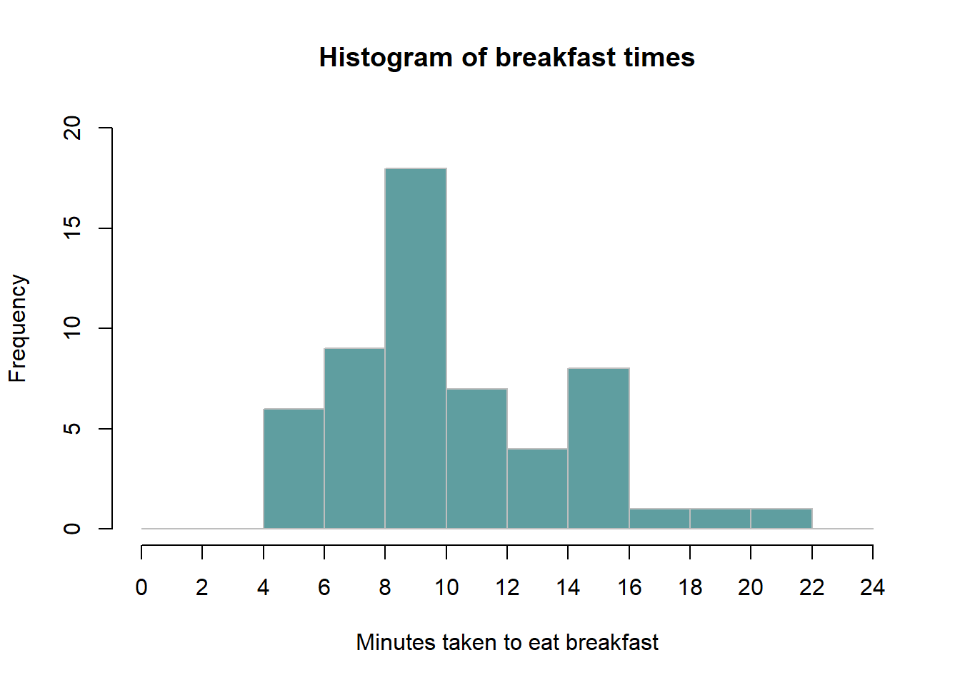
The histogram immediately gives an idea of the distribution of data.
Boxplot. A boxplot, sometimes called a box and whisker plot, is a type of graph used to display patterns of quantitative data by splitting the dataset into quartiles. The body of the boxplot consists of a “box” (hence, the name), which goes from the first quartile (\(Q1\)) to the third quartile (\(Q3\)). Within the box, a vertical line is drawn at the \(Q2\), the median of the data set. Two horizontal lines, called whiskers, extend out from the front and back of the box. The front whisker goes from \(Q1\) to the smallest non-outlier in the data set, and the back whisker goes from \(Q3\) to the largest non-outlier. The reach of the whiskers is not allowed to be more than 1.5 x \(IQR\). They capture everything within this reach. While the choice of exactly 1.5 is arbitrary, it is the most commonly used value for box plot. Any observation that lies beyond the whiskers is labeled with a dot. The purpose of labeling these points - instead of just extending the whiskers to the minimum and maximum observed values – is to help identify any observations that appear to be unusually distant from the rest of the data.
Example 1.9 (Basic boxplot) Terje wanted to see the distribution of his dataset by using a boxplot. The result is as follows:
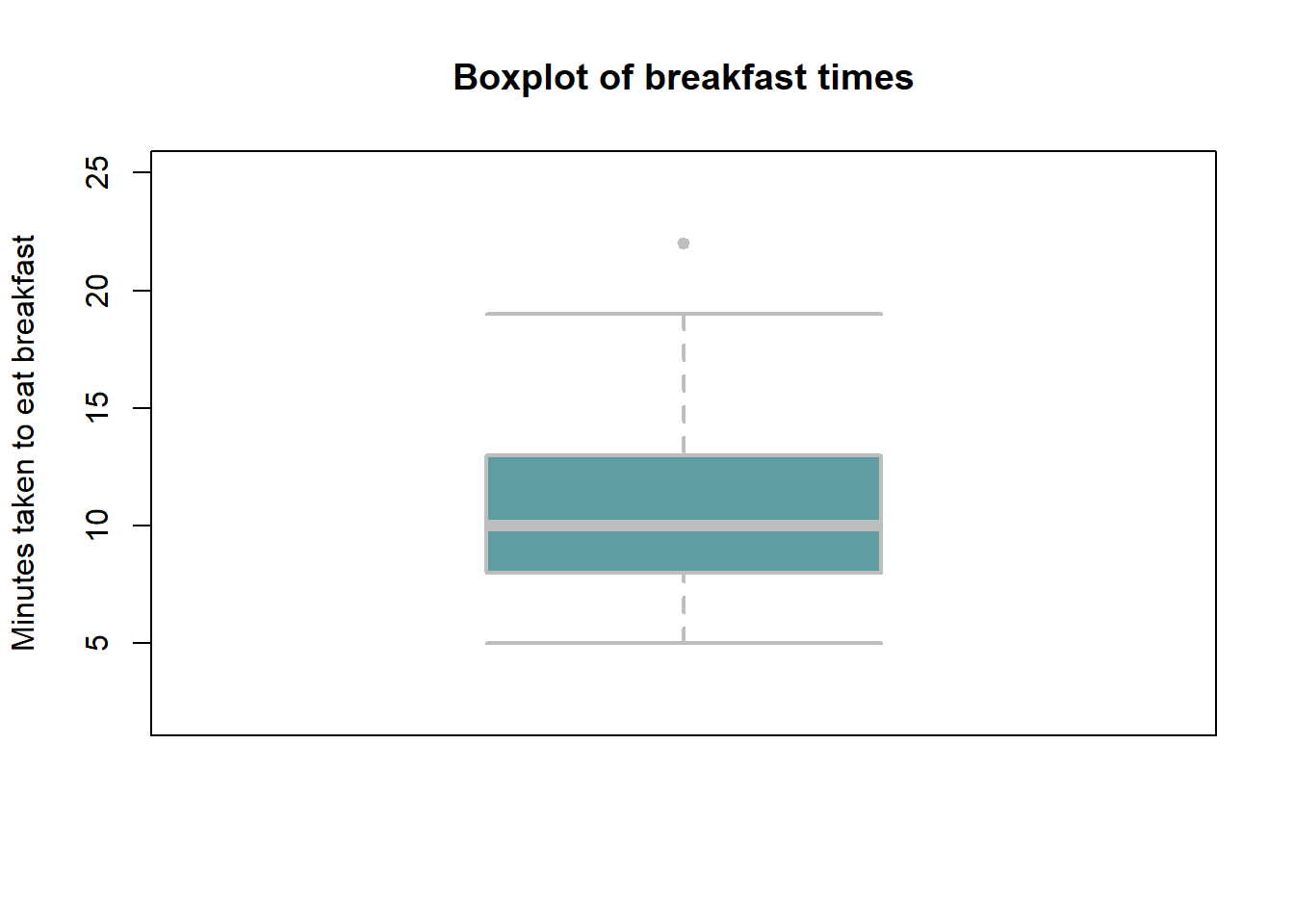
From this boxplot, Terje could easily tell the median, lower and upper quartiles of her dataset. There is also one outlier; can you identify it from the data given in Example 13? What is the interquartile range?
Scatterplot. A basic scatterplot takes two variables \(x, y\) and plot each pair of observations \((x_i, y_i)\) along two axes. It is particularly suitable for identifying patterns of dependency/correlation between two continuous variables. A small example shows the idea.
Example 1.10 (Basic scatterplot) You’re a marketing analyst for Molde Toys AS. You gather the following data on monthly spending on advertisements and the volume of sales:
| Adspend | 20 | 40 | 30 | 50 | 10 | 70 | 80 | 65 | 70 | 45 |
| Sales | 250 | 350 | 300 | 480 | 150 | 680 | 630 | 600 | 670 | 520 |
Now we can look at a plot of Sales vs Adspend:
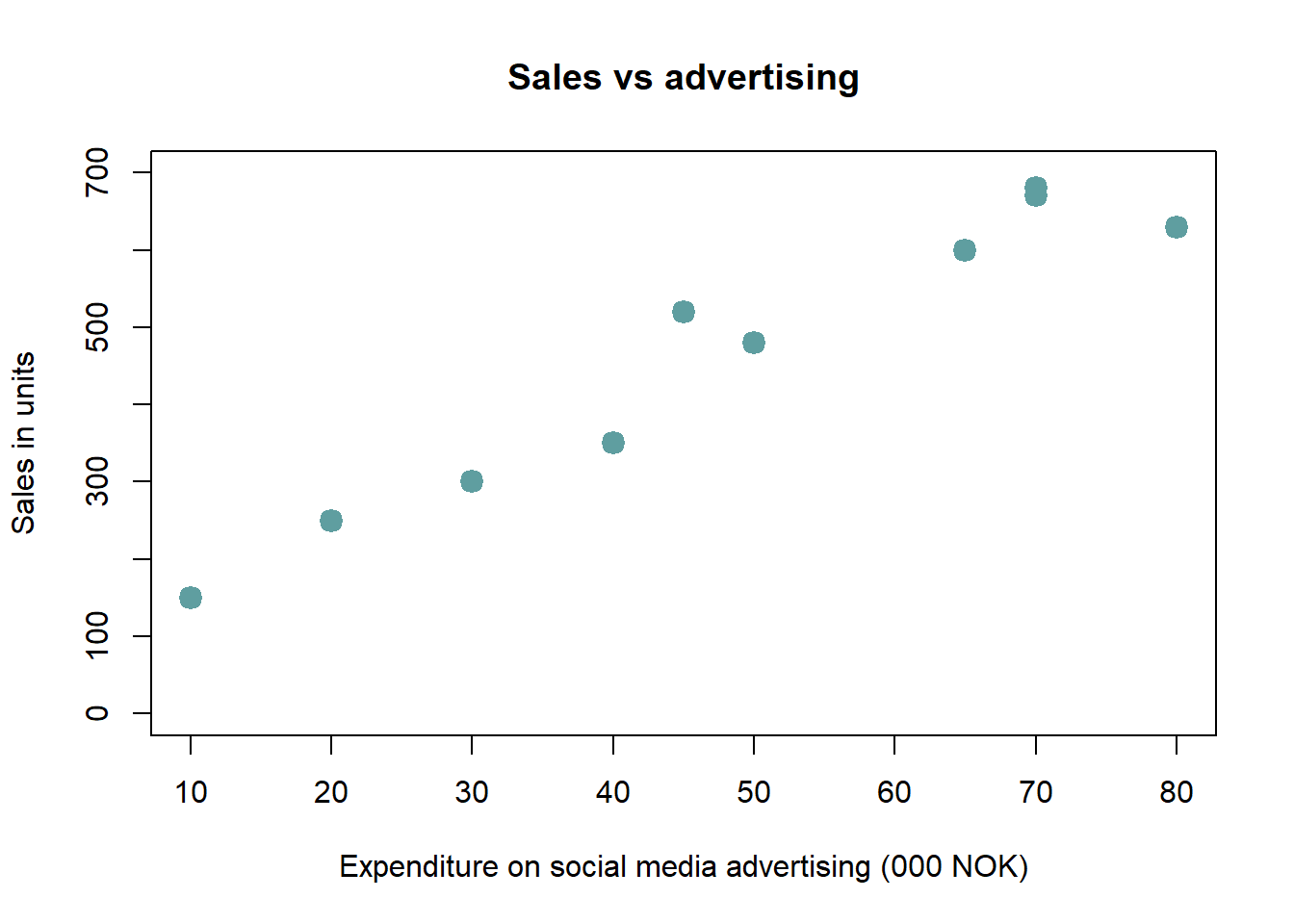
We immediately see that increased advertising comes together with higher sales. Can you guess the correlation coefficient between advertising and sales? It’s 0.969.
1.4.4 Examining categorical variables.
We now turn to categorical variables, to see some of the common ways to summarize such data.
Summary table. This is a list of categories and the number of elements in each category. The table may show frequencies (counts), % or both.
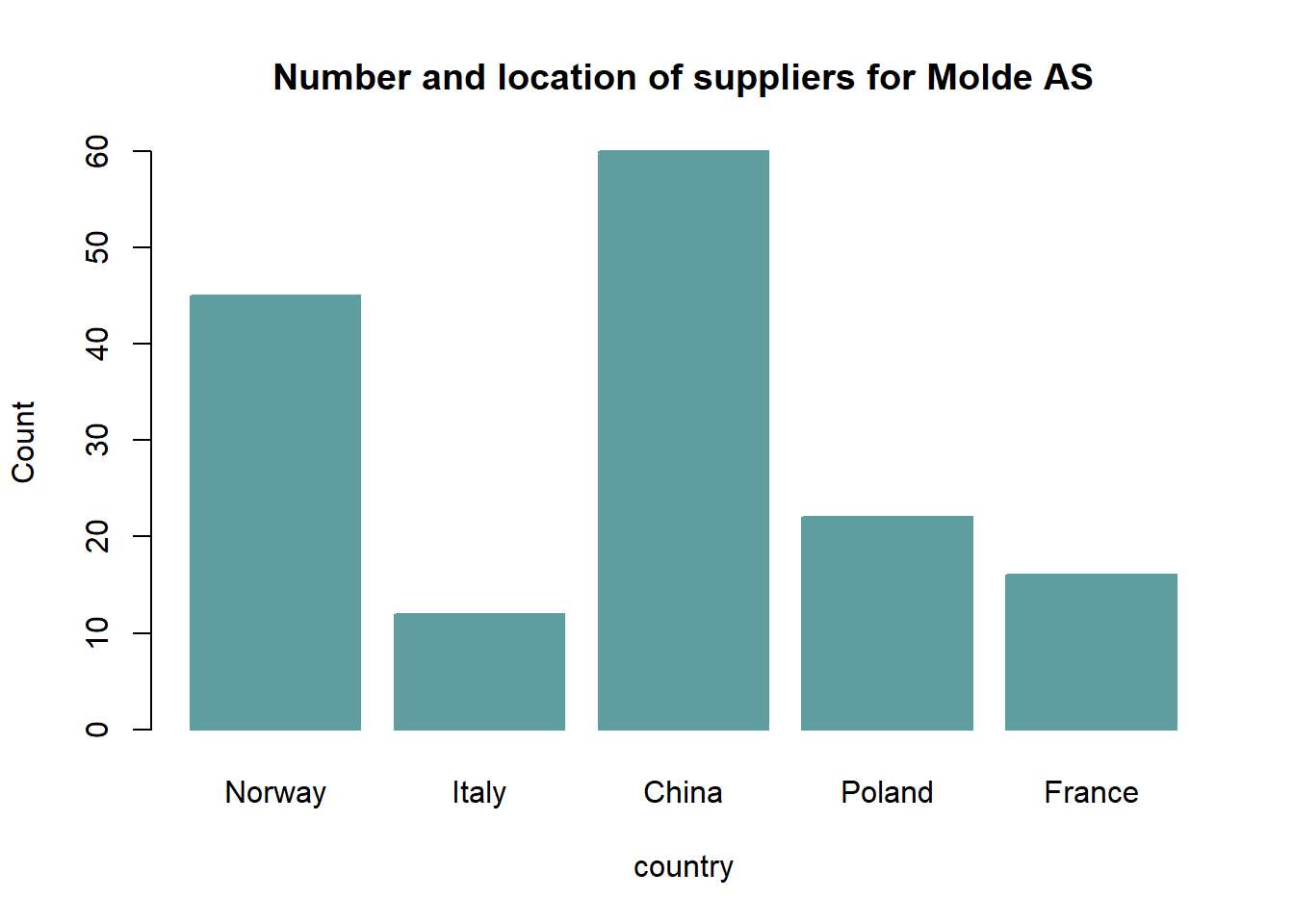
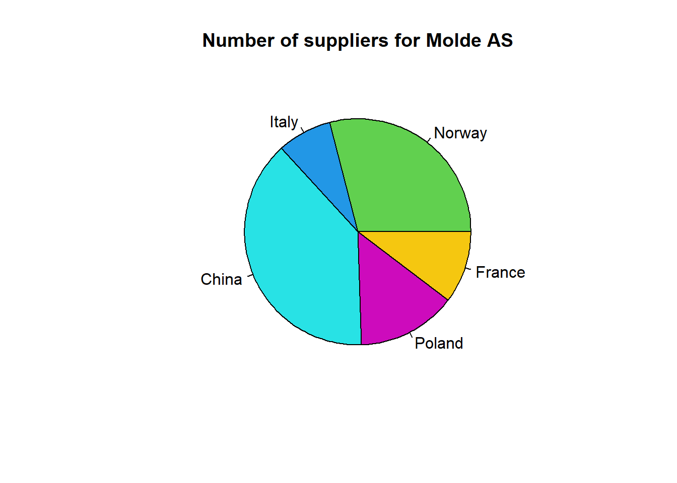
Example 1.11 (Summary table) Assume a company called Molde AS has reported the location of its suppliers. A summary table of their report is presented as follows:
| Country | Norway | Italy | China | Poland | France |
|---|---|---|---|---|---|
| Number of suppliers | 45 | 12 | 60 | 22 | 16 |
| Percent | 29 | 8 | 39 | 14 | 10 |
Bar-chart. A bar chart or bar graph is a chart or graph that presents categorical data with rectangular bars with heights or lengths proportional to the values that they represent. One axis of the chart shows the specific categories being compared, and the other axis represents a measured value. The bars can be plotted vertically or horizontally. A vertical bar chart is sometimes called a column chart.
Example 1.12 (Bar chart) A bar chart showing the number of suppliers for Molde AS according to location is as follows:
Pie chart. This is the chart that uses “pie slices” to show relative sizes of data. The arc length of each slice is proportional to the quantity it represents.
Example 1.13 (Pie chart) A pie chart showing the number of suppliers for Molde AS according to location is as follows:
Crosstabulations. A commonly occurring need in economics and social science research is to analyze the relation between categorical variables. Crosstabulation is a presentation of data in a tabular form in order to aid in identifying the relationship between categorical variables. Assume that you have two categorical variables, firm size and industry category and you want to identify the relationship between them. The starting point for such work is usually to produce a crosstabulation of the variables. That simply means if firm size has categories ‘small’, ‘medium’, ‘large’ and industry category has categories ‘Consulting’, ‘Repair & Maintenance’ and ‘Oil & Gas’, one wants to figure out how many firms are in each combination of categories for firm size and industry category. For example, how many of the sampled firms are classified simultaneously as a ‘medium’ on firm size and as ‘Repair & Maintenance’ on industry category. It may also be of interest to compute percentages of various kinds. For example, one might want to figure out how many percent of all small size firms fall in each industry category.
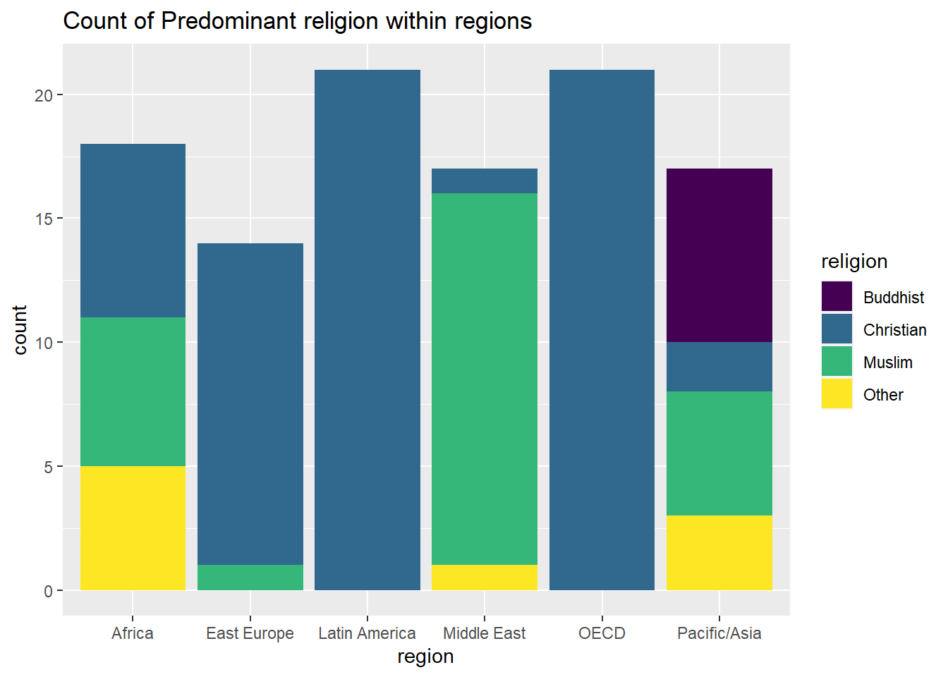
Example 1.14 (Cross tabulation) In this example, we will use a dataset called “world95”. This dataset is available on Canvas under the Module named “Datasets”. It is presented in two formats, csv and excel. Open the excel file and take a look. One should note that the data material is from 1995 and most of the numbers will have changed since then. That is however unimportant for our purposes here. The objects are countries of the world (there are n = 109 countries in the sample), and we see some of the recorded numerical variables like the size of the population (in thousands) and the percentage of the population living in urban areas. We also see two categorical variables from this data material. One is the predominant religion of the country, and another is the geographical region. Our knowledge of the world tells us that there should be some clear dependencies between the variables such that some religions occur much more frequently as predominant in some particular regions. A crosstabulation can reveal the patterns. We might want to see, for each region R and religion S, the count of how many countries in R have S as the predominant religion. We may also for example want to see, for any R and S, how many percent of all countries in R has S as predominant religion. The following table shows a cross tabulation
The results of a cross tabulation are as follows. Here we have collapsed some religions into a general category “Other” to reduce the number of combinations somewhat. We also collapsed some variants into a larger category called “Christian”.
##
##
## Cell Contents
## |-------------------------|
## | N |
## | N / Row Total |
## | N / Col Total |
## | N / Table Total |
## |-------------------------|
##
##
## Total Observations in Table: 108
##
##
## | religion
## region | Buddhist | Christian | Muslim | Other | Row Total |
## --------------|-----------|-----------|-----------|-----------|-----------|
## Africa | 0 | 7 | 6 | 5 | 18 |
## | 0.000 | 0.389 | 0.333 | 0.278 | 0.167 |
## | 0.000 | 0.108 | 0.222 | 0.556 | |
## | 0.000 | 0.065 | 0.056 | 0.046 | |
## --------------|-----------|-----------|-----------|-----------|-----------|
## East Europe | 0 | 13 | 1 | 0 | 14 |
## | 0.000 | 0.929 | 0.071 | 0.000 | 0.130 |
## | 0.000 | 0.200 | 0.037 | 0.000 | |
## | 0.000 | 0.120 | 0.009 | 0.000 | |
## --------------|-----------|-----------|-----------|-----------|-----------|
## Latin America | 0 | 21 | 0 | 0 | 21 |
## | 0.000 | 1.000 | 0.000 | 0.000 | 0.194 |
## | 0.000 | 0.323 | 0.000 | 0.000 | |
## | 0.000 | 0.194 | 0.000 | 0.000 | |
## --------------|-----------|-----------|-----------|-----------|-----------|
## Middle East | 0 | 1 | 15 | 1 | 17 |
## | 0.000 | 0.059 | 0.882 | 0.059 | 0.157 |
## | 0.000 | 0.015 | 0.556 | 0.111 | |
## | 0.000 | 0.009 | 0.139 | 0.009 | |
## --------------|-----------|-----------|-----------|-----------|-----------|
## OECD | 0 | 21 | 0 | 0 | 21 |
## | 0.000 | 1.000 | 0.000 | 0.000 | 0.194 |
## | 0.000 | 0.323 | 0.000 | 0.000 | |
## | 0.000 | 0.194 | 0.000 | 0.000 | |
## --------------|-----------|-----------|-----------|-----------|-----------|
## Pacific/Asia | 7 | 2 | 5 | 3 | 17 |
## | 0.412 | 0.118 | 0.294 | 0.176 | 0.157 |
## | 1.000 | 0.031 | 0.185 | 0.333 | |
## | 0.065 | 0.019 | 0.046 | 0.028 | |
## --------------|-----------|-----------|-----------|-----------|-----------|
## Column Total | 7 | 65 | 27 | 9 | 108 |
## | 0.065 | 0.602 | 0.250 | 0.083 | |
## --------------|-----------|-----------|-----------|-----------|-----------|
##
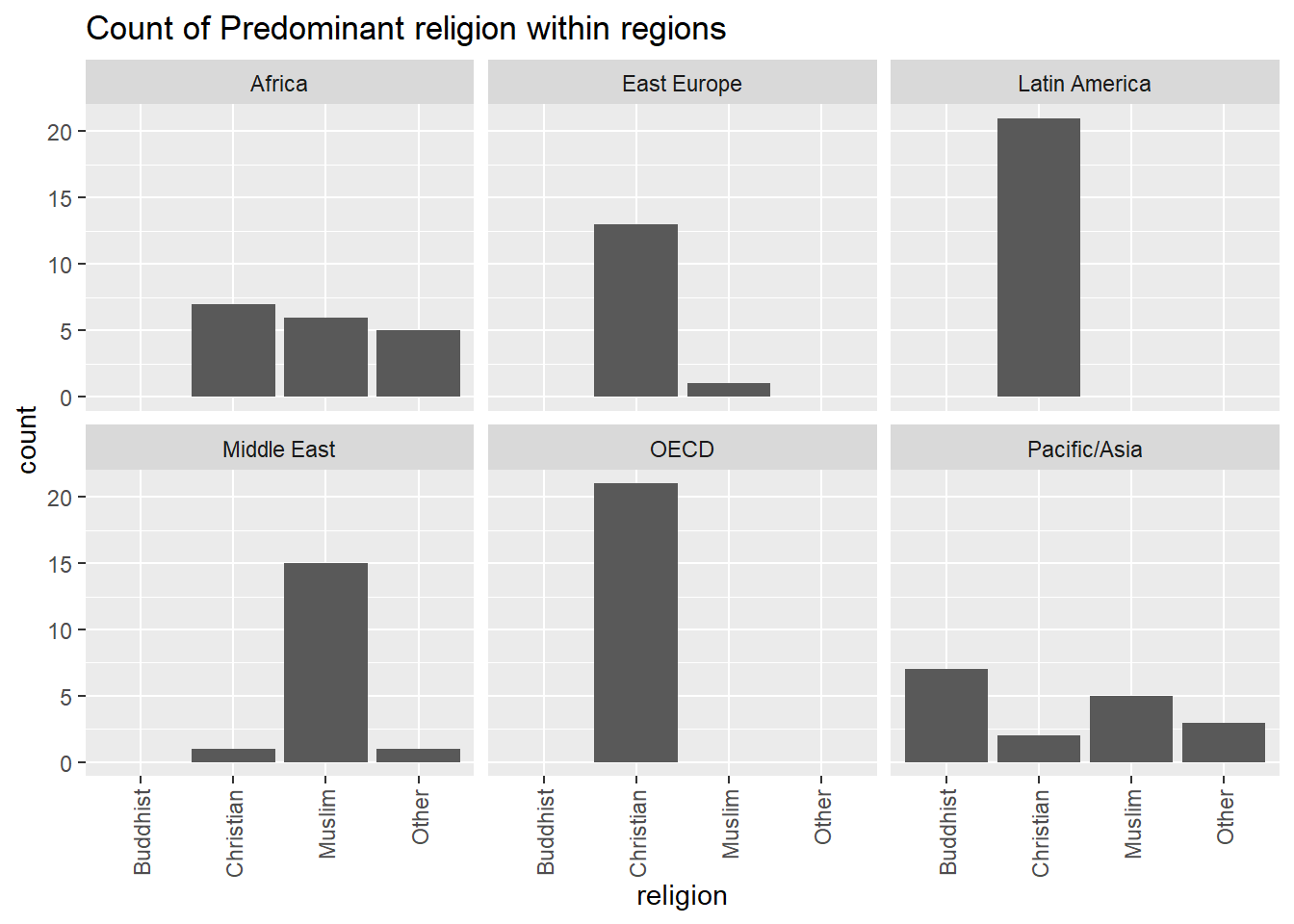
## From the table above, we see that there are six regions and four religion categories, so we get altogether 24 combinations of regions/religions to count, plus the totals within regions and religions. From the table we can then extract whatever might be of interest. For instance in East Europe, we have a total of 14 countries, 13 (about 93%) are predominantly catholic, and so on. We can also observe the expected strong dependencies between religion and region, as for instance Latin America is exclusively Christian, while Africa has an even mix of certain religions. There are several natural ways to visualize the results of a crosstabulation. One could use separate bar- or pie-charts for each region, each showing that region’s distribution among religions. Such figures are more readable than the whole table.
We finish the theory in this chapter with a few visualizations relating to the crosstabulation above. For example one can make a barplot by region, and fill the columns by the frequency of religion:
Or, we can break up data by region, and make barplots based on the frequency of religion:
This ends our simple introduction/review regarding basic descriptive statistics.
1.5 Statistical software
As you may have noticed, “manual” computation of statistical key figures is a tedious and time-consuming activity, especially when a large number of observations is involved. Just imagine how demanding it would be if we had data for 200 firms in Table 4a and we wanted to find “manually” the mean and median values of rev2019. The good news is that we have computers that can efficiently perform such tasks. There is a wide range of open-source and proprietary statistical software. In LOG708, we will use a software environment for statistical computing and graphics called R. The R environment is widely used among statisticians and scientists for data analysis and visualization. We will interact with R through an interface called RStudio (a software application that makes R easier to use). Both R and RStudio are free and easy to download. We will come back to R in detail in chapter 3.